What to Include on Your Escape Room Website Homepage
If your escape room homepage is doing its job, a visitor should be able to land on it and make a confident booking decision without clicking around, hunting for information, or convincing themselves to “check back later.”
That is the bar.
Most escape room websites miss this not because they lack information, but because they lack structure. The homepage ends up being a mix of story, visuals, and ideas without a clear decision path. The result is friction, hesitation, and lost bookings.
This guide walks through a proven homepage structure designed specifically to support immediate bookings, which is the primary goal for most escape room businesses. Each section exists for a reason, and each one plays a role in reducing uncertainty and moving the visitor closer to a decision.
Your Homepage Is a Sales System
Before getting into sections, it is important to establish the underlying mindset.
Your homepage is not there to tell your full story, explain everything you do, or impress other escape room owners. Instead, it serves as a critical part of your marketing funnel and it exists to answer one question for a potential customer:
“Is this an experience I should book right now?”
Every section on the homepage should either build trust, reduce uncertainty, clarify the experience, or make the next step obvious. Anything that does not support one of those goals is a distraction.
1. Hero Section
The hero section carries more weight than any other part of the homepage. This is where a visitor decides whether to keep scrolling or leave.
At a minimum, this section should clearly answer what type of experience this is, who it is for, and what action the visitor should take next.
Strong hero sections are simple, not clever. They do not rely on lore, long narratives, or abstract taglines. They communicate value quickly and pair it with a clear booking CTA.
From a decision-making standpoint, this reduces cognitive load. The visitor does not have to interpret or guess. They immediately understand where they are and what to do.
If someone cannot explain what you offer after five seconds on your homepage, the hero section is failing and needs to be reworked to provide more clarity.
2. Info Section
Once the visitor understands what you offer, the next question they subconsciously ask is, “Why this escape room instead of another one?”
This is where a short info section with two to four key points works extremely well. These points shouldn't describe individual rooms yet. Instead, they should communicate high-level differentiators that apply to the business as a whole. This might include things like offering private rooms only, building custom escape room experiences, creating challenges that work well for families, being locally owned and operated, or being the first or only escape room in the area. The goal is to give visitors immediate reasons to believe they are in the right place before they start comparing specific rooms.
This section builds confidence by reinforcing value early in the decision process. From a psychology perspective, it creates justification. People want to feel good about their choice, and these differentiators help them begin forming that rationale before moving deeper into the page.
3. Reviews and Social Proof
Claims without proof create skepticism. This is why reviews should follow your differentiators, not be buried on a separate page.
At this point in the flow, you have told visitors who you are and why you are worth booking. Now you show them that other people agree.
This can include short review excerpts, star ratings, or customer photos paired with quotes. The purpose is not to overwhelm the visitor, but to reinforce trust at the exact moment they are deciding whether to continue.
Social proof reduces perceived risk. It answers the unspoken concern of “What if this isn’t worth it?” before it turns into hesitation.
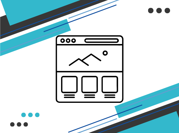
4. The Rooms Section
This is the most important section of the homepage.
Each room card should give enough information for someone to decide which room fits their group, whether it matches their expectations, and whether they want to book it now.
Common elements that work well here include the room theme, a short story hook, difficulty or challenge level, group size range, time length, scare factor if relevant, price or price range, a short description, and a clear CTA to book that room.
Not every venue needs all of these, but every venue needs clarity. Visitors should not have to click into multiple pages just to understand what they are choosing.
From a sales standpoint, this is where momentum matters. Once someone sees a room they like, the path to booking should be obvious and immediate.
5. FAQ Section
FAQs are optional, but extremely effective when used correctly.
This section should address questions you already know customers ask before booking, such as arrival time expectations, refund or rescheduling policies, waivers, late arrivals, private bookings, and events or parties.
The key is restraint. This is not a full support center. It is a friction-reduction tool. By proactively answering common concerns, you prevent small uncertainties from turning into abandoned sessions.
6. Secondary CTA
After someone has scrolled through your rooms and FAQs, they are either ready to book or very close.
This is where another clear CTA matters. It does not need to be creative. It needs to be obvious.
At this stage, repetition is not annoying. It is helpful. You are giving motivated visitors a clear next step without making them scroll back up.
7. Contact Information
Contact information is not essential for every visitor, but it is reassuring.
Some people will want to confirm details or ask a quick question before booking. Making it easy to reach you prevents them from leaving to “think about it” and never returning.
The key is that this section supports booking, not replaces it. Whoever answers the phone or inbox should be trained to guide people toward booking an experience.
A Note on Focus and Distractions
The most common issue with escape room homepages is a lack of focus.
When the primary goal is booking, everything should support that goal. Long origin stories, detailed team bios, and extensive philosophy sections may be interesting, but they do not help most visitors decide to book.
Those elements belong on secondary pages. The homepage is about decision-making, not storytelling.
If you want a broader breakdown of how escape room websites should function overall, including page roles and site structure, see this related guide: What Makes a Good Escape Room Website
Bringing It All Together
A strong escape room homepage follows a clear flow: clarify the experience, establish credibility, present options, remove objections, and make booking easy.
This is not about copying a template. It is about respecting how people actually make decisions online.
If building or restructuring your homepage around this flow feels difficult, that is normal. Most issues come down to prioritization, not effort.
If you want hands-on help implementing this structure or refining an existing homepage, that is exactly how we approach escape room website design at Unlocked Bookings.
At the end of the day, your homepage does not need to say everything. It just needs to say the right things, in the right order, to the right person.